Simplified Campaign Creation in Ads Manager
Imagine walking into a cockpit to drive to the grocery store. That’s what our campaign creation experience felt like for small business owners. Meta had built a powerful, three-tiered system: Campaign, Ad Set, and Ad—designed for advanced advertisers who needed granular control but SMBs and First-time advertisers were abandoning the flow at high rates.
/background
Business problem.
The primary business problem was a significant funnel leakage among high-potential advertiser segments. While the platform offered powerful advertising tools, the complexity of the setup process was actively preventing a large portion of the target market from launching their first campaigns.
My role.
I led design direction for a unified campaign creation experience across SMB, lightweight UI (LWI), and MAIBA (chat-led ad creation), aligning cross-functional teams and establishing scalable design patterns through implementation.
/result
The validation phase confirmed our hypothesis: reducing complexity directly translates to higher advertiser success and increased business value.
First-time advertisers in the experimental group (simplified flow) published campaigns at a significantly higher rate than those in the control group.
/process
Data-informed setting prioritization.
Together with the Small Medium Business Advertisers (SMBA) team, we first identified "dead-end" settings—complex fields that SMBs rarely modified but frequently caused them to abandon the flow and finalized a list of "Core Settings" (high-value, high-modification) to keep visible, while marking others as "Advanced."
Core simplification principles
Our initial design strategy was built on three radical shifts from the standard campaign creation model. We aimed to replace system-centric complexity with a user-centric path to launch.

- Hierarchy Consolidation (3-to-1): we collapsed the traditional three-tiered structure (Campaign > Ad Set > Ad) into a single, unified page. By extracting only the most critical settings from each level, we eliminated the cognitive load of navigating between multiple pages and hierarchies.
- Data-Driven Pruning: Using drop-off data as our guide, we removed settings from the interface that advertisers rarely interacted with and surfaced only the "must-have" decisions, ensuring that every element on the page served a clear purpose for an SMB advertiser.
- Streamlined Creative Setup: The "Ad" section is historically the highest point of friction and abandonment. Because our entry point was a boosted post, we leveraged the fact that the creative already existed. We simplified the ad setup to just two essential modifications:
- Destination: Where the traffic should go.
- Call to Action (CTA): What the user should do.
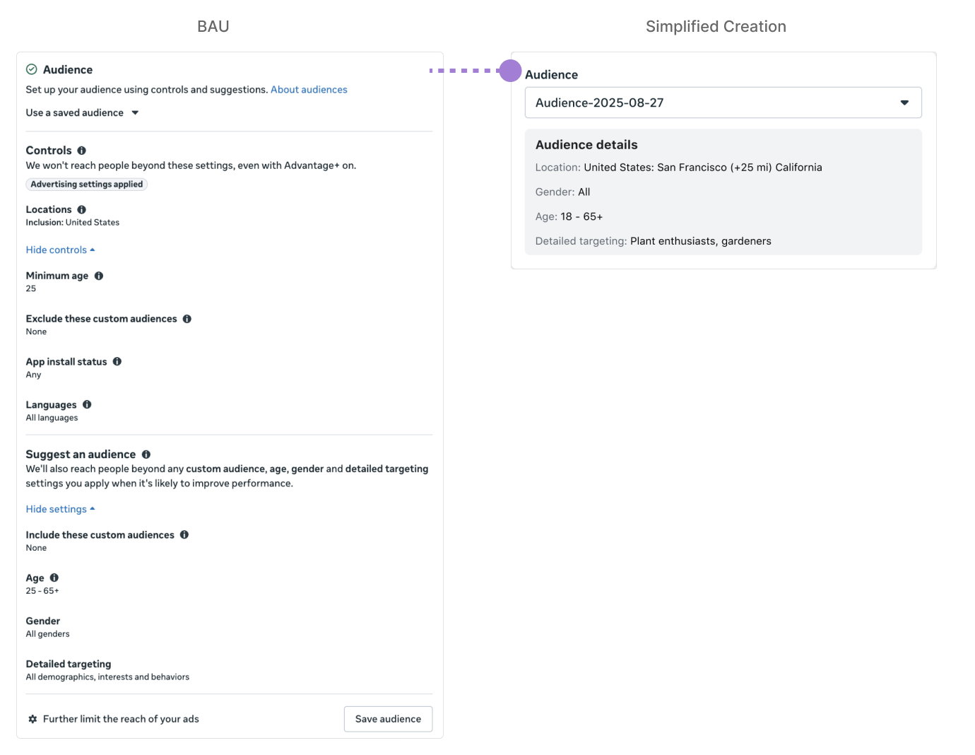
Challenges with the initial approach.
Initial designs faced pushback from the Lead Engineer, who warned against "design bifurcation" (creating duplicate, hard-to-maintain code packages).
Leadership Feedback: Early reviews highlighted friction in the flow and revealed a parallel chat-led creation effort by another team.
Cross-team alignment workshop.
To resolve the engineering concern of design bifurcation and align on the consistent experience across multiple surfaces, I led a brainstorming workshop with the SMBA team, Lightweight Interfaces UI team, and MAIBA team (chat-led creation). The goal was to find a unified design pattern that could be reused across different product areas without duplicating code or maintenance effort.
The workshop's solution was the decision to apply the Progressive Disclosure (PGD) pattern. While we had previously used "Level 1 Friction" (minor hiding), we decided to test a more aggressive "Level 3 Friction" hypothesis to maximize simplification for SMBs.
Why PGD Worked:
- Avoids Bifurcation: Because settings are hidden/collapsed rather than removed, we maintain a single code path.
- Preserves Control: Advanced advertisers can still access every setting; we simply add a layer of friction (the "See more" accordion) to keep the default view clean.
- Consistency: We ensured that settings do not move around within the card, maintaining the user's mental model from the standard flow.
The PGD Pattern & Summary Cards.
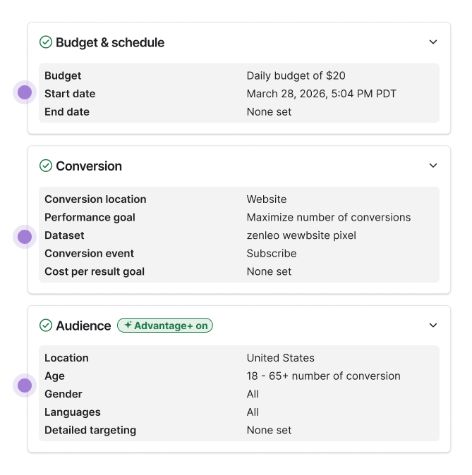
We established a clear set of rules to govern when a setting should be visible or hidden, using a "Summary Card" vs. "Setting Card" model. Below are some of the rule examples.
Default to Collapse:
All cards start collapsed to reduce cognitive load.
- Once a user expands and modifies a setting, it remains visible in the summary view to reflect their active choice.
- Optional fields are hidden in the summary view to prioritize only the most impactful information.
Summary cards collapsed
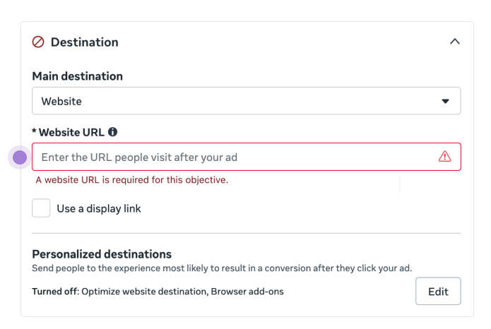
Auto-Expand Exceptions:
- The setting is missing or required.
- Data shows it is a frequently edited field for that advertiser.
- There is a specific product-driven reason for visibility.
Summary card expanded
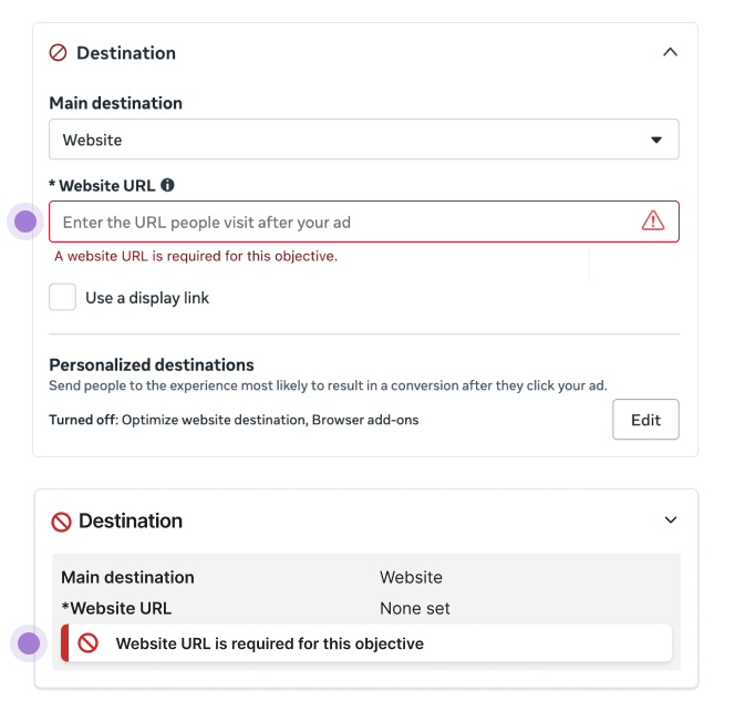
Show warning/error guidance cards:
If the expanded card contains a guidance card with the following types - Warning, Error, Policy, Violation, Legal & Policy - Reflect them in the collapsed card view. Show the guidance card as a collapse component in the collapsed card view using the guidance card component.
Summary card expanded
High-Velocity Handoff 🤖
I used Claude Code to apply our established PGD logic and rules across all settings and stress test all use cases. This enabled me to share a precise, implementation-ready design spec with the engineering team, ensuring that our "narrowed" focus translated directly into a high-quality build.
/launch & monitoring
Segment performance breakdown.
After launching the experiment, we moved into a phase of data monitoring. Our initial approach was intentionally aggressive—we wanted to strip the flow down to its absolute minimum to truly understand which settings were indispensable for advertisers.
The data provided a clear picture of how different advertiser segments interacted with the simplified flow.
First-time Advertisers
iRev pos & higher publish rate
Active Advertisers
iRev neutral & neutral publish rate
We didn't view exits as a failure, but as a roadmap. By analyzing exactly which settings advertisers modified after exiting to the advanced flow, we were able to refine our designs with surgical precision. After launching the experiment, we moved into a phase of data monitoring.
Example - Creative Copy: We noticed a high volume of advertisers exiting to modify their ad copy. Consequently, we updated the simplified design to include creative copy modification directly in the one-page flow.
Scaling for the Future: Cover all entry points & from 1:1:1 to 1:M:N
While 92% of SMBs use a simple 1:1:1 campaign structure, our goal is to support the full spectrum of small business needs.
- I worked with the MAIBA team to scale the simplified flow from a 1:1:1 structure to a 1:M:N structure (one campaign to multiple ad sets and ads).
- We ensured that settings do not move around within the card, maintaining the user's mental model from the standard flow.

Please contact me for more details of this project!
volhadouban@gmail.com

